4

Hallo again, it’s Katie – the Product Designer who has been working on your custom theme. Thank you all for your patience.

As mentioned in our first post – below you'll find the site design I came up with based on your original ideas.

Your site design

I know that our goals were to keep this site looking professional and clean, while still giving a nod to the German Language. I did a lot of research and tried out many ideas; I hope that you like the one I am sharing today.

I am very grateful for the extensive feedback provided by your community and made sure to take note of every comment you left. In addition to the feedback provided in the information-gathering post, here are two additional images that I was inspired by:

Inspiration image Additional inspiration image

Colour scheme

I've included both palettes here – the main site, and the meta site.

Proposed (bold) colour palette for the German Language Stack Exchange site, incorporating 6 colors: gold (#A98C46), white (#FFFFFF), dark blue (#001489), red (#8C0C0C), light blue (#51ADDA), and cobalt blue (#003DA5).

For the main site, I wanted to focus on the colors that the 6 country flags have in common: red, gold, white and blue. I chose these colours while keeping in mind that we did not want to specifically reference Germany or any other individual country.

  • Red is present in the flag of every country where German is a spoken language.
  • Gold is in the German and Belgian flags, as well as the stars of the EU flag (while understanding that not all 6 countries are EU members).
  • White is in the flags of Austria, Switzerland, and Luxembourg, plus Italy and Poland (where there are quite a few speakers).
  • And multiple blues, in reference to the flags of Luxembourg and Liechtenstein.

Below, I have included one version with strong colours, and another version that is more muted; please let me know your preference on these options. I would also like to thank one of our awesome Community Managers for this palette idea and the reasoning behind it.

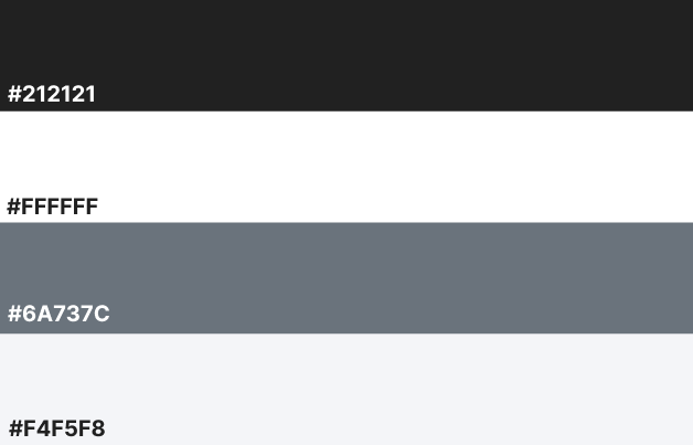
For the meta site, we will be using a greyscale version, of course. 😄 Note that there are two options – one version has filled-in letters, while the other has outlined letters. Please let me know your preference. Here is the colour palette I used there:

Proposed (greyscale) colour palette for the German Language Meta Stack Exchange site, incorporating 4 colours: black (#212121), white (#FFFFFF), dark grey (#6A737C), and very light gray (#F4F5F8).

Page design

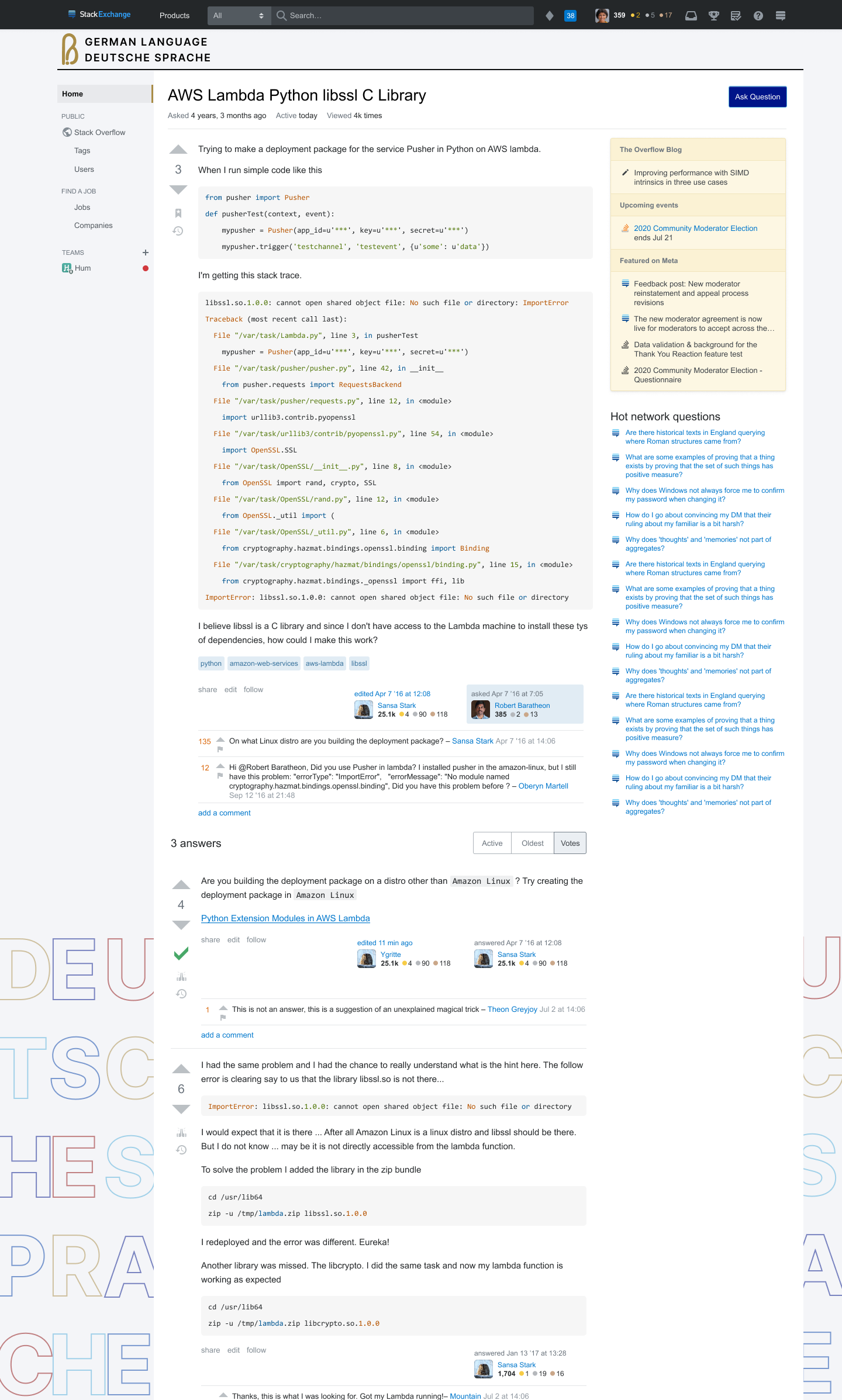
Here are two versions of the proposed page design for the main site; the first version uses a muted colour palette for the "Deutsche Sprache" text at the bottom of the page, while the second version uses bolder versions of that colour palette. (Click each thumbnail to view the full-size image.)

Proposed page design, as described in the sections above, showing a question page on the German Language Stack Exchange site. The site logo (as described below) appears in gold, with the text "German Language" in all-caps appearing to the right of it, and the text "Deutsche Sprache" below that (both lines of text in black). The "Ask Question" button appears with a dark-blue background. The text "Deutsche Sprache" also appears in all-caps at the bottom of the page, in the background (below the left and right sidebars); each letter appears in a different colour drawn from the colour palette described above. In this version, the colours are muted. Proposed page design, as described in the sections above, showing a question page on the German Language Stack Exchange site. It is largely identical to the previous proposed page design, except that the colours of the letters in the background at the bottom of the page appear more bold, rather than muted.

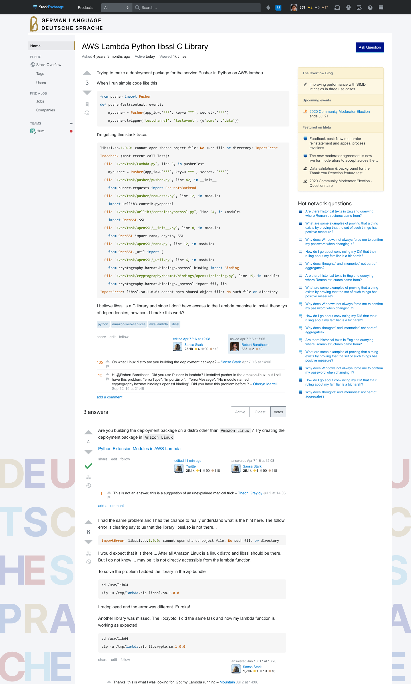
Also, here are two versions of the proposed page design for the meta site; in the first version, the "Deutsche Sprache" text at the bottom of the page is filled in, while it's outlined instead in the second version.

Proposed page design, as described in the sections above, showing a question page on the German Language Meta Stack Exchange site. It is largely identical to the proposed page design for the main site, except that it uses the greyscale colour palette for the Meta site, as described above. The logo appears in black, as does the background of the "Ask Question" button. The "Deutsche Sprache" text in the background at the bottom of the page is filled in; the first word appears in a darker grey, while the second appears in a lighter grey. Proposed page design, as described in the sections above, showing a question page on the German Language Stack Exchange site. It is largely identical to the previous proposed page design, except that it uses the outlined version of the "Deutsche Sprache" text in the background at the bottom of the page; the first word is filled in with light grey, while the second word is transparent inside.

This is how the site's Questions page would look:

Proposed page design, as described in the sections above, showing the site's Questions page (/questions).

Logo

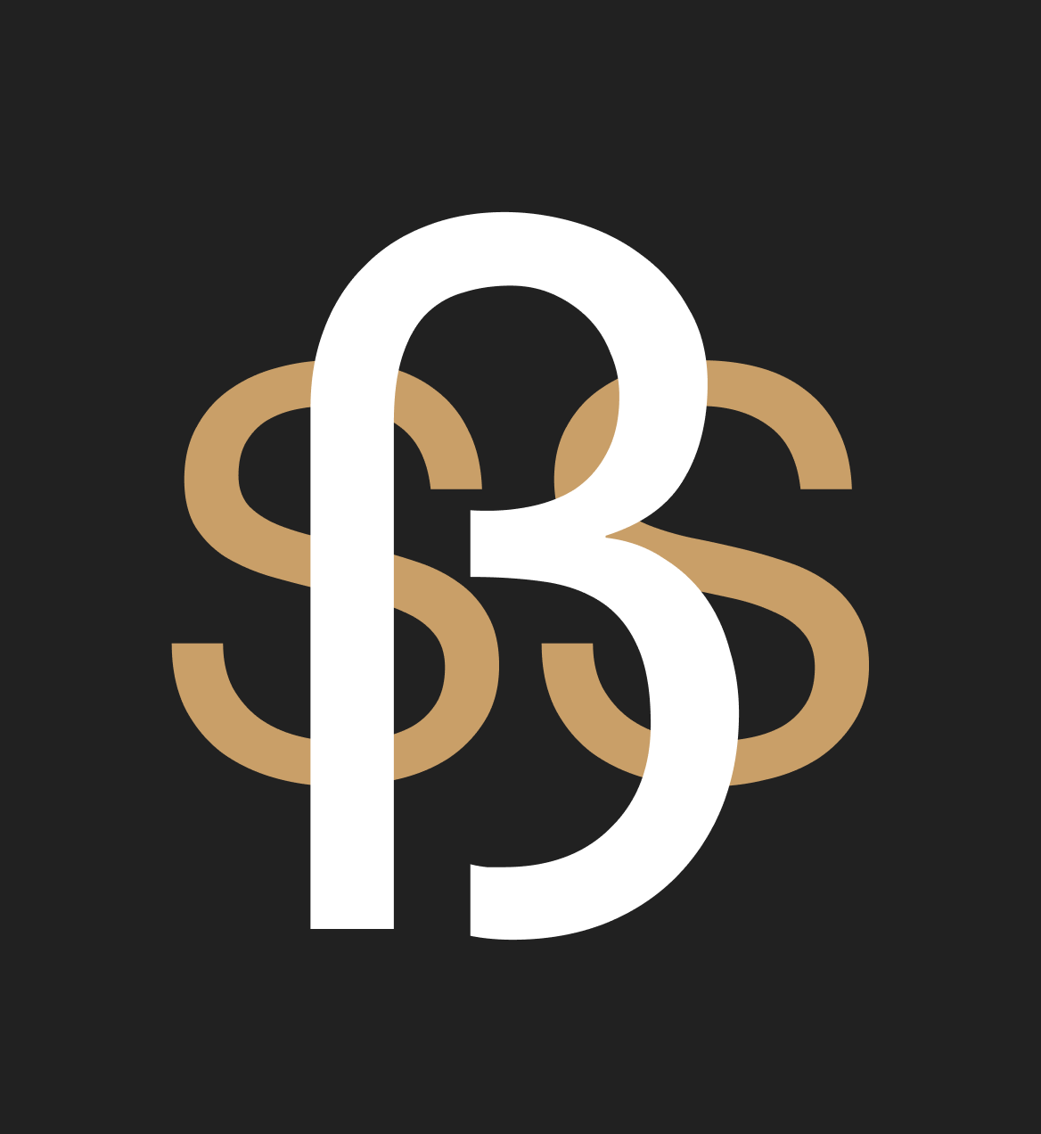
For the logo, I used the design made by Wrzlprmft (danke!):

Proposed logo and favicon for the German Language Stack Exchange site (suggested by Wrzlprmft), as described above.

I also included the translated German heading in the site banner, as requested in the information-gathering post:

Proposed banner image for the German Language Stack Exchange site, as described above. It has the site logo, and to the right of that there are 2 lines of text in all-caps, one above the other. The first line says "German Language", and the second line (below it) says "Deutsche Sprache".

404s, Errors, and Captchas

The first image here with Witwe Bolte will be used for the 404 page, while the remaining 3 images shown here are all contenders for the error page.

I like all of the options provided by Wrzlprmft (danke again), so please let me know which, if any, preference you may have. PMF’s comment mentions that these images are also available in colour, so that is an option as well.

Image containing 4 options for 404 and error page images.

The same thing applies to our captcha page, so please let me know which image you prefer we use there:

Image containing 2 options for the captcha page image.

We hope you enjoy this design, but if something doesn’t feel right, now is your chance to share your feedback. This window for feedback will be open one week. We will then work to incorporate feedback as best as we can, finalize things on our end, and lastly, deliver the design to your site.

13
  • How will the background letters appear on a short question? I am somewhat afraid that they might be too distracting.
    – Wrzlprmft Mod
    Commented Jun 23, 2022 at 12:08
  • I think that the “first impression”, i.e. gold playful logo, black all-caps banner on grey background separated by a line strikes the right overall mood as discussed here. I wouldn’t change much of that.
    – Wrzlprmft Mod
    Commented Jun 23, 2022 at 12:51
  • 1
    I am also glad to hear that you like the design I provided. I really tried my best to stay true to the feedback that was provided by you all.
    – Disco St. Ives Staff
    Commented Jun 24, 2022 at 13:07
  • 1
    I have no strong preference on the 404/error/captcha images (otherwise I would have said so when suggesting). If anything, the respective first choice is most lighthearted since nobody’s life is endangered or nobody had to die, respectively.
    – Wrzlprmft Mod
    Commented Jun 24, 2022 at 13:48
  • To give another opinion: I find the proposals very impressive! The less saturated colors would probably be less distracting and I like the idea, to use outline characters on Meta.
    – guidot Mod
    Commented Jun 26, 2022 at 11:28
  • I think there are some stylistic clashes: The logo has an art nouveau style, the letters look very modern, and Max und Moritz is another totally different style register.
    – Jonathan Herrera Mod
    Commented Jun 26, 2022 at 11:56
  • @JonathanScholbach: What makes you classify the logo as art nouveau? I don’t see any typical elements, except maybe rounded forms, but those are inherited from the letters. — As for Max and Moritz, I agree that they clash, but given that they are for error messages and similar, i.e., when something has clashed, I consider this okay. Many similar pages over the network have clashing styles, e.g.: 1, 2, 2, 4, 5.
    – Wrzlprmft Mod
    Commented Jun 26, 2022 at 13:19
  • @Wrzlprmft "Art Nouveau" was just my gut feeling. Regardless if this is a correct label, I just wanted to express the mismatch of logo and the rest of the design (the background letters), and then, on top the error messages.
    – Jonathan Herrera Mod
    Commented Jun 27, 2022 at 17:58
  • I would avoid to bring in any justification based on nation flags. German language is not tied to nations; it is probably impossible to give a non-debatable definition of "countries where German is spoken" (Just for illustrating the problem: Why are you mentioning 6 countries? What is this based on?) - Also learners of German can come from anywhere. I have nothing against the colors themselves, I would just avoid any ties to nations.
    – Jonathan Herrera Mod
    Commented Jun 27, 2022 at 18:02
  • I voted -1, because the page design is too distractive. It looks nice, but I think, it might turn out impractical.
    – Jonathan Herrera Mod
    Commented Jun 27, 2022 at 18:03
  • This logo version is not bad at all, but I've missed the rationale & different versions earlier. I initially scratched my head and tried to figure out 'what's that'? Followed by 'why a paperclip'? (German language–bureaucracy, MS Clippy?) Now, in blow-up, I try to see a stick-figure a la xkcd on its head… That need not mean that much, nor indicate even just a minor request for modification. Just my 2ct on 'initial impression'. Repeat: not anywhere near a strong negative reaction, maybe even a positive one: 'ambiguity, how intriguing'? I'd like to know how many 'uninitiated' 'get it'? Commented Jul 2, 2022 at 15:13
  • Your followup post: German Language site design and logo — Final draft
    – V2Blast Staff
    Commented Jul 12, 2022 at 15:15
  • Update: New site design launched
    – V2Blast Staff
    Commented Sep 30, 2022 at 19:21

5 Answers 5

3

Logo

All of this comes with the caveat that I suggested the idea of the logo and have spent quite some time looking at a similar logo already.

  • I think the logo works generally well without playing with colour (like my last suggestions).

  • Some variants of the logo feel a bit crammed. Specifically the marked gap in the following is thinner than the lines of the logo:

    Logo with the gap between left eszett stem and bottom question-mark stem marked.

    This will probably be particularly relevant for the favicon.

  • The logo’s typography contrasts with the rest’s (site title and background letters), in particular:

    • rounded vs. square line caps
    • lowercase vs. all caps
    • “handdrawn” imperfections vs. strictly geometric

    I am leaning towards this being a good thing, as it creates just the right balance of formal and playful and creates a distinction between logo and text. However, I would really have to see the alternative(s) to form a more thorough opinion. I guess this all boils down to: Have you considered this? (And if the answer is, e.g.: “Yes, it didn’t work.”, I will trust you and say no more.)

4
  • 2
    You're correct that the logo was hand-drawn using vectors. I played around with many different fonts, logo shapes, colours, header layouts, etc. and this is the one that felt like the best fit. Capitalising the logo header and adding a semi-bold weight helped it stand out from the rest of the text on the page, while still appearing as professional and clean.
    – Disco St. Ives Staff
    Commented Jun 24, 2022 at 13:12
  • 1
    The logo doesn't make any sense to me. Not knowing what it was supposed to be, it looked more like a symbol from a South Asian language. (Reverse Google search does indeed bring up Bengali and Odia characters.) I don't think I would ever associate it with the German Language. It should be reconsidered. Why not use the ß on its own?
    – idmean
    Commented Jun 27, 2022 at 13:20
  • 1
    If you must combine the ß with a question mark, I would suggest trying something similar to the book cover used as inspiration.
    – idmean
    Commented Jun 27, 2022 at 13:26
  • 1
    Hello idmean, thanks for this input! I can certainly reconsider the logo if we feel it does not make sense for this site. The main reason why we did not want to use the ß on its own was that it does not exist in Swiss German. That being said, I can play around with a few other ideas. :D
    – Disco St. Ives Staff
    Commented Jun 27, 2022 at 13:48
3

Thank you everyone for the feedback provided thus far. Here are 3 more design proposals based on what we have discussed in this post.

  1. Meta site design with all outlined letters, and none filled with colour.
  2. Main site design with all outlined letters, and in a more muted state.
  3. Main site design with the filled letters but also in a more muted state.

Please let me know your thoughts on these follow-up proposals. :)

enter image description here

enter image description here enter image description here

3
  • 2
    I kinda like the middle one of these three.
    – ouflak
    Commented Jun 27, 2022 at 13:53
  • I think all suggestions are an improvement and I prefer the outlined variant (middle) for main. I think the meta outlines could be a bit less intense (i.e., more grey than black), but it’s okay. My accessibility consultant concurs.
    – Wrzlprmft Mod
    Commented Jun 27, 2022 at 15:25
  • 1
    I am just a disinterested observer here (I've been watching the theme development on all the network sites that are getting new themes), and Im poking in my head to say in a totally non-binding and non-voting manner... I like the middle one, quite a lot.
    – Philippe StaffMod
    Commented Jun 28, 2022 at 6:56
2

Background letters

  • I generally like them. They say language and not much more than that (which is good) while avoiding an overly minimal design.

  • I am somewhat concerned that they distract once you scroll down sufficiently, but I would really need to see that in action to properly judge it. For this reason only, I would choose for the muted colour scheme. However, if distraction is indeed a problem, a much stronger muting may be required to fix it.

    I consulted somebody with an attention disorder and they said that the letters were extremely distracting because they are coloured, large, and text (as opposed to an image like Worldbuilding’s robot). The letters would scream for attention. They suggested some things that might help:

    • The outline version used for meta without any fill.
    • Muting the colours. (Coloured outlines without fill?)
    • Scrambling the position of the letters even more such that they overlap, such that the brain does not mistake the letters for text, i.e., information.
  • Meta: I prefer the outline variant because it is more distinctive and fits the nature of meta, i.e., outlining the main site (also works in German: “umreißen”). However, I would go all the way and use outlines only (i.e., no grey fill), maybe even for the logo.

5
  • 1
    I'm glad that you like the letters! I am also glad that you brought up the accessibility of the design; this is very important and something I tried to consider in terms of contrast, etc. Muting the colours even further would be quite easy to do on my end, so I'm happy to play around with that a bit further.
    – Disco St. Ives Staff
    Commented Jun 24, 2022 at 13:17
  • 1
    In terms of Meta, I am also happy to use the outlined version and like the reasoning behind it (as it's an outline of the main site). I can surely remove the grey fill so that it's only outlined letters.
    – Disco St. Ives Staff
    Commented Jun 24, 2022 at 13:17
  • 1
    How about using outlines everywhere (coloured on main, grey on meta)? That could turn down the distraction considerably (even though the meta metaphor gets lost).
    – Wrzlprmft Mod
    Commented Jun 24, 2022 at 13:20
  • 1
    I was worried that doing both as filled, or both as outlined, wouldn't add enough distinction between the main site and meta. However, accessibility takes priority and I am more than happy to give that idea a try!
    – Disco St. Ives Staff
    Commented Jun 24, 2022 at 13:22
  • 1
    I wouldn’t consider distinguishability of main and meta is a major factor. It’s nice for experienced users to be able to quickly know where they are, but for those a dash of colour (or the absence thereof) suffices. Inexperienced users won’t know what to look for anyway.
    – Wrzlprmft Mod
    Commented Jun 24, 2022 at 13:34
2

Here are the final 3 options for the logo, please let me know which one you feel best represents this community. As always, colours can be modified if you believe there is a better choice.

Once we have decided on a logo, this theme will begin to be implemented into code. I look forward to getting that out to you very soon!

Danke!

enter image description here

enter image description here

enter image description here

3
  • 1
    Can you post this as a new question with the three options as separate answers (so they can be directly voted upon)? Since the question is already a few weeks old, most users won’t notice this answer. Also, a potential vote and discussion can only happen in the comments, where it could become convoluted.
    – Wrzlprmft Mod
    Commented Jul 12, 2022 at 13:50
  • 1
    Absolutely, will write up that post right now.
    – Disco St. Ives Staff
    Commented Jul 12, 2022 at 13:59
  • The new post: German Language site design and logo — Final draft
    – V2Blast Staff
    Commented Jul 12, 2022 at 15:15
0

enter image description here

ist ein Herz 😘

You must log in to answer this question.

Not the answer you're looking for? Browse other questions tagged .