30

Correct German quotation marks look like this:

correct German quotation marks

The main font used for this site – Tahoma – however renders them like this:

incorrect German quotation marks

Notice the direction of the closing quotation mark: It should run from bottom towards the top right (180° rotation of opening mark), but it doesn't.

This is apparently a known bug in some fonts (thanks Konrad Rudolph).

I think we should switch to a font that displays correct german quotation marks correctly.


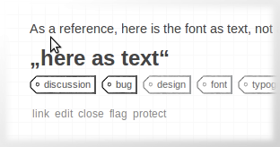
As a reference, here is the font as text, not as Image:

„here as text“

6
  • 5
    The Wiki page is not forgiving! "This downward stroke generates an extremely awkward reading experience in German texts because it is absolutely unusual in German typesetting, typographically inharmonic and orthographically incorrect."
    – Tim
    Commented May 25, 2011 at 11:17
  • Thanks for merging. Does anybody have an idea for a good font?
    – fzwo
    Commented May 25, 2011 at 12:34
  • 2
    Is it just me or does somebody also think that we should just use " instead?
    – Bobby
    Commented May 25, 2011 at 20:04
  • 3
    @Bobby, that's certainly what most people are doing. Still, this is a site about the German language, and it can't display German punctuation correctly for those who go to the trouble of trying to do it right - and we've already had at least two questions regarding this exact topic.
    – fzwo
    Commented May 25, 2011 at 22:48
  • 9
    @Bobby: I would say it is just you. On this StackExchange site, I precisely try to use the correct typographical symbols, so that others can learn it correctly as they see it. I might be the only one who cares about it that much, but I definitely wouldn’t accept some “Use " instead”-ruling.
    – poke
    Commented May 27, 2011 at 11:31
  • I added the quotation marks as text, so that everybody might see, whether he is (still) affected and how. If it is an error in the font, it might get fixed there, might it not? And, afaik, what is displayed can depend on the browser settings (you can prohibit font settings), on the OS which fonts are installed, and on the fonts themselves - they might get updated. For instance me, in Firefox on Linux, I see two comma-like symbols low and high, very round, without a direction inwards or outwards. I've taken them from the selfhtml-Zeichenreferenz, as ” „ they are listed there. Commented Feb 11, 2012 at 17:31

5 Answers 5

2

Also see the same rendering as @Takkat, and it also seems that the site no longer uses Tahoma but rather Helvetica. I consider this to be a norepro at this point.

4

There is another slight problem with the current main font to be seen in this question: Welche Bedeutungen kann das Adjektiv "günstig" haben?

enter image description here

I don't think this can be fixed in the context of the font used - letter-spacing: 1px looks fine for those few problem cases, but ugly for everything else. It might be an additional argument for switching the font.

12
  • Looks OK on my Mac (in Opera). Has your screenshot been resized? Fonts look slightly bigger on my screen - if not, maybe you're zoomed out a bit?
    – fzwo
    Commented May 30, 2011 at 7:07
  • @fzwo the screenshot has been resized, but it looks even more notable in original size (I'm on Chrome on Windows 7).
    – Pekka
    Commented May 30, 2011 at 7:10
  • @fzwo Safari and Safari on Mac uses an different render engine than chrome and firefox and any win pc. So the screenshot can't be a copy of what you're seeing ;) Commented Jun 2, 2011 at 0:25
  • @Samuel Herzog I know - that's why I specified my system :) In any case, this seems to be a problem in a relatively popular configuration. I think we should move to another font ASAP. But how?
    – fzwo
    Commented Jun 2, 2011 at 16:20
  • Its not an asap needed. Thanks to webfonts it shouldnt be a problem nowadays when we're getting our final design. Lets work on making german.SE popular before. thats much more important in my eyes (although I don't like the font at all ;)) Commented Jun 2, 2011 at 17:18
  • 2
    One of my computers doesn't have Tahoma available so falls back to a Helvetica-like font. It's a huge improvement. Unfortunately I don't see this being addressed before it comes to the site design which won't be worked on until the site's about to leave beta. Individuals could use Stylish in the meantime if it's really bugging them.
    – misterben
    Commented Jun 6, 2011 at 11:25
  • I don't see Image, has it been expired? Can you resubmit it via the imagehoster of SE, i.imgur.com? Commented Feb 11, 2012 at 18:08
  • @user I can't: the CDN that hosted it is down, with no word on whether it will ever come back again, and I don't have the original image any more :(
    – Pekka
    Commented Feb 11, 2012 at 18:10
  • @user I think I remember what I wanted to illustrate after all. I made a new image.
    – Pekka
    Commented Feb 11, 2012 at 18:11
  • I don't think so. :) I think you meant the headline, where both, opening and closing quotes are on top, but in different directions. Commented Feb 11, 2012 at 18:27
  • @user I'm pretty sure I did mean the almost unreadable ll in billig. I meant it just as an additional observation speaking against the font that is currently used, not as a real answer to this question
    – Pekka
    Commented Feb 11, 2012 at 18:29
  • Ah. I couldn't even read the 'billig' in your screenshot - it looks quiete different in my browser. Commented Feb 11, 2012 at 21:08
3

This is currently one of the highest-rated questions on meta.german.SE, but it doesn't have any answers. I think this suggests that there is consensus among us that the font should be changed.

So, how to go about that?

5
  • It would be nice, If you could add the link to the question in that site. I guess a lot of the current users don't know about that site, which is the best place to ask such technical questions
    – bernd_k
    Commented May 28, 2011 at 17:57
  • @bernd_k I must admint I am confused by your comment. What site do you mean?
    – fzwo
    Commented May 28, 2011 at 18:12
  • I mean meta.stackoverflow.com that is the place to report bugs and propose feature changes concerning the software the these question & answer sites run. This meta here is more for in group communication, which questions to close, to migrate, to learn the people who finally qualify as moderators for this site. Sorry I think I misunderstood you, when you talked about Meta. Now I suppose you mean this site
    – bernd_k
    Commented May 28, 2011 at 18:22
  • @bernd_k Yes, meta.german.SE is what I meant; sorry for the confusion.
    – fzwo
    Commented May 28, 2011 at 18:40
  • No problem. All these site work like real life. You must act to get reactions. Don't expect to find all answer in some faq. It takes some time to understand how these sites work. And it is a bit fun to discover the features. It's a bit learning like achild.
    – bernd_k
    Commented May 28, 2011 at 19:13
1

I already noted this as a comment, but I think it deserves an answer of its own.

What is displayed can depend on the browser settings (you can prohibit font settings, override, specify substitution fonts), on the OS which fonts are installed, and on the fonts themselves, which might get updated.

For instance me, in Firefox on Linux, I see two comma-like symbols low and high, very round, without a direction inwards or outwards.

Here is a screenshot with yellow background:

screenshot with yellow background

And here the same thing as text, what you see: :)

„here as text“

I'm not sure whether this is Tahoma on my system, or a substitution. However - an error in the font might as well be reported to the creators of the font, which should fix it there. Changing to another font is of course a solution too.

8
  • 1) Just noticed: I never messed with my fonts and on my Windows 7 machine, the rendering is correct. Verdana has it fixed too. 2) The font in your screenshot is obviously not Tahoma. :)
    – musiKk
    Commented Feb 11, 2012 at 22:14
  • So is it Geneva, Arial or sans-serif? These are listet by my html-tool. I think Arial, since I don't find something named Geneva on my System. Commented Feb 12, 2012 at 0:41
  • Geneva is typical for Macs. Also it doesn't look like Arial. Most probably it's some other sans-serif font that is configured in your browser. My Linux system has the correct quotes for Tahoma as well. So for me this bug is "solved".
    – musiKk
    Commented Feb 12, 2012 at 9:18
  • Don't you want to mention that as an answer, with a screenshot? Commented Feb 12, 2012 at 14:09
  • Sorry. I was mistaken. The text examples in this thread use the wrong closing quotes. As can be seen in your screenshot they use the 99 style whereas in German the 66 is used. Compare de.wikipedia.org/wiki/…
    – musiKk
    Commented Feb 12, 2012 at 14:48
  • Your comma-like quotation marks do have direction: Towards the lower left. This makes them wrong; differently than the original example, but still wrong. By the way, in Opera, the text renders differently to your image (thanks for that!), while on the iPhone, it renders exactly like in your image.
    – fzwo
    Commented Feb 12, 2012 at 14:53
  • 1
    Waiting for the font designer to fix the font, and waiting for the changed font to trickle down to end-users is not a practical solution, IMHO. Submitting a bug report to the foundry would be nice, but doubtless they already know about it. The pragmatic course of action for us would be to switch fonts to one with proper quotation rendering.
    – fzwo
    Commented Feb 12, 2012 at 14:55
  • @musiKk: From one posting which I didn't find now, I have in memory, that the reason for the german style was, that inward guillemets >>sample<< are closest to the character inside (to the outside, there is normally a blank) at one central point, while the other style has two closest points, which are probable to collide at the first character twice, which is most often uppercase. And the source of the quote style are the guillements. But if they aren't slant, but vertical, the reason to use them either way are obsolete. Commented Feb 12, 2012 at 18:03
1

This is how the font is rendered here on both, Ubuntu 11.04 Chromium 16 'de' locale and on a vanilla Ubuntu 11.10 Firefox 9 'en' locale, and Ubuntu 12.04 Firefox 11 'en' locale. Msttcorefonts are not installed on any of these systems.

enter image description here

Looks fine to me.

5
  • Yes, that's correct rendering. You're probably using a different font or different version of the font.
    – fzwo
    Commented Feb 12, 2012 at 15:48
  • @fzwo: I have no idea what font I have here, just vanilla chromium using default Ubuntu fonts. By the way tests with Ubuntu 11.10 Firefox 9 'en' locale gave the same correct rendering.
    – Takkat
    Commented Feb 12, 2012 at 15:57
  • You can use locate -i tahoma to look, whether a tahoma-font is present on your system, and analogous for Geneva, which is the second in the list of the html element. Commented Feb 12, 2012 at 18:05
  • 1
    The problem is not that there are fonts that look OK. The problem is, that the intended font is messed up. If you don't know what it looks like, a specimen can be found in the Wikipedia. If Stackexchange switches over to @font-face, everybody will get the dubious benefit of wrong rendering. In the meantime Ubuntu users should be able to get the font by installing the msttcorefonts package.
    – musiKk
    Commented Feb 12, 2012 at 19:22
  • Not that it matters much, but I now found out that msttcorefonts doesn't provide Tahoma anyway. I don't know where to get it for Ubuntu. Kind of ironic that the typographically superior systems produce an inferior result...
    – musiKk
    Commented Feb 13, 2012 at 8:41

You must log in to answer this question.

Not the answer you're looking for? Browse other questions tagged .